Understand Box and Whisker Plots: With Applications in Python
- Amara James Moosa

- Mar 21
- 4 min read
©Math with Mr. J
Introduction
Effectively presenting data insights is crucial. Box plots provide a clear visual summary of numerical data, aiding both exploration and communication. This guide covers box plot fundamentals, usage, and Python implementation. Download the data below and follow the code inline for practical application with your IDE at the bottom. New Python learners can find resources on AnalystsBuilder and DataCamp.
What is a box plot?
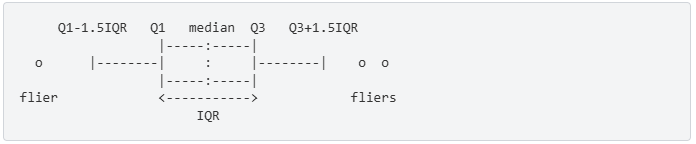
Box plots visualize numerical data distribution. The box represents the middle 50% (IQR), with the median as a line. Whiskers show overall spread, and points beyond are outliers.
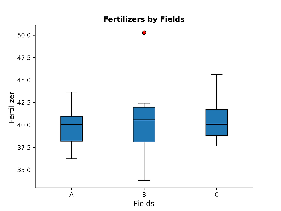
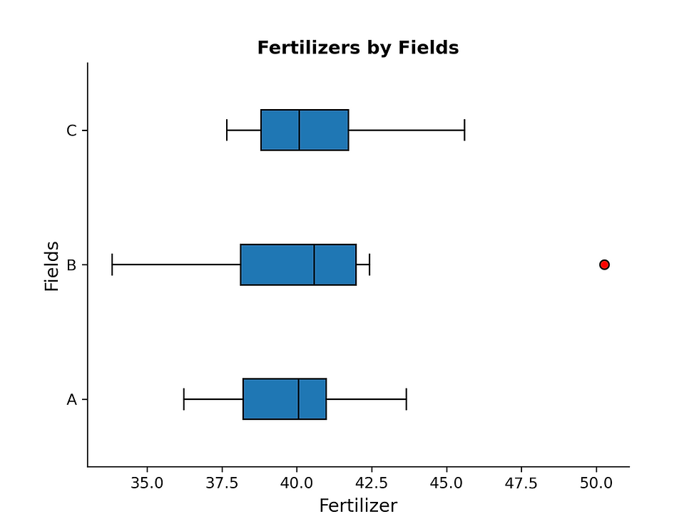
This box plot depicts fertilizer application grouped by field. The median fertilizer application is highest in Field B, as shown by the median line's location. Field B also contains an outlier, evident from a point beyond the whisker. The box plot provides a clear representation of the overall fertilizer application trends.
Expand to view the vertical box plot python code for the plot
#import the required python libraries
#for data manipulation and visualization

import pandas as pd
import matplotlib.pyplot as plt
import numpy as np
import os
import warnings

#Turn off warnings
warnings.filterwarnings("ignore")

#load the required dataset
file_path = #please enter your file path
df = pd.read_excel(file_path)

#Peek at the data
df.head()

#Group data by fields so that we can plot it by group
grouped_data = df.groupby('Field')['Fertilizer'].apply(list)

#Define the plot
#fill the boxes with color
#make the median color black.
plt.boxplot(grouped_data,
		   labels=grouped_data.index,
		   patch_artist=True,
            medianprops=dict(color='black')
            flierprops=dict(markerfacecolor='red', marker='o')
           )
#Set the plot title and labels for clarity
plt.title('Fertilizers by Fields',
		 fontsize=12,
		 fontweight='bold'
		)
plt.xlabel('Fields', fontsize=12)
plt.ylabel('Fertilizer', fontsize=12)

#Iterating over all the axes in the figure
#and make the Spines Visibility as False
for pos in ['right', 'top']:
	plt.gca().spines[pos].set_visible(False)

#Diplay the plot
plt.show()
When to Use Box Plots
Use box plots to compare numerical distributions. They summarize median, spread, and outliers, but don't show detailed distribution shapes.
Interpreting Box Plots
The box represents the interquartile range (IQR), encompassing the central 50% of the data. The median is denoted by the line within the box. Whiskers indicate data variability, while points beyond the whiskers represent potential outliers.
Best Practices
Comparative Analysis: Box plots excel at comparing multiple groups. Use histograms for detailed single-group distributions.
Reordering Groups: Order groups by median for clarity when no inherent order exists.
Box Plot Options
Layout Considerations: Horizontal or Vertical
Choose box plot orientation for optimal readability. When comparing numerous groups or groups with lengthy names, a horizontal layout is preferred. This prevents label overlapping and truncation, enhancing clarity. Conversely, when visualizing data trends over time, a vertical orientation is generally more intuitive, aligning with the typical time axis representation.
Expand to view the horizontal box plot python code
#We are using the same packages and data from above
#Define the plot
#fill the boxes with color
#make the median color black.

plt.boxplot(grouped_data,
		   labels=grouped_data.index,
		   patch_artist=True,
            medianprops=dict(color='black'),
            flierprops=dict(markerfacecolor='red', marker='o'),
		   vert=False # Make it horizontal
           )
#Set the plot title and labels for clarity
plt.title('Fertilizers by Fields',
		 fontsize=12,
		 fontweight='bold'
		)
plt.xlabel('Fields', fontsize=12)
plt.ylabel('Fertilizer', fontsize=12)

#Iterating over all the axes in the figure
#and make the Spines Visibility as False
for pos in ['right', 'top']:
	plt.gca().spines[pos].set_visible(False)

#Diplay the plot
plt.show()
Annotate data counts when using variable widths
When box widths vary in a box plot, annotate each group with its data point count. This clarifies group sizes, as scaled widths can be misleading. Directly labeling 'n=count' prevents misinterpretations and ensures accurate comparisons.

Expand to view annotated box plot above python code
#We are using the same data and packages from above

#Define the plot
#fill the boxes with color
#make the median color black.
plt.boxplot(grouped_data,
		   labels=grouped_data.index,
		   patch_artist=True,
            medianprops=dict(color='black')
            flierprops=dict(markerfacecolor='red', marker='o')
           )
#Set the plot title and labels for clarity
plt.title('Fertilizers by Fields',
		 fontsize=12,
		 fontweight='bold'
		)
plt.xlabel('Fields', fontsize=12)
plt.ylabel('Fertilizer', fontsize=12)

#Iterating over all the axes in the figure
#and make the Spines Visibility as False
for pos in ['right', 'top']:
	plt.gca().spines[pos].set_visible(False)

#Add annotations

#Diplay the plot
plt.show()
Key Considerations
Comparison: Box plots excel at visually comparing the distributions of different data groups.
Overview: Provides a quick, high-level summary of a dataset's central tendency and spread.
Median: The median line within the box indicates the central value, robust against extreme values.
Spread (IQR): The box itself represents the interquartile range, showing the middle 50% of the data. Whiskers indicate data variability.
Outliers: Points beyond the whiskers highlight potential outliers, requiring further investigation.
Ordering: Sorting unordered groups by their median values enhances comparison.
Orientation: Choose horizontal or vertical orientation based on data and readability.
Box Width: Use box width to represent sample size, annotate the width to provide context.
Cross-Industry Applications
Product: Compare user engagement across features, pinpointing unusual behavior or outlier user groups.
Web: Analyze website performance metrics, detecting anomalous traffic patterns or outlier user sessions.
Security: Detect anomalies in network traffic or system logs, flagging potential security breaches or outlier events.
Data Science: Explore datasets to visually identify potential outliers that require further investigation, impacting model accuracy.
Conclusion
Box plots efficiently visualize numerical data, aiding in comparison and analysis. Understanding their components and applications empowers data analysts across industries, especially when using Python.
Article Resources
Company | Details |
Analysts Builder | Master key analytics tools. Analysts Build provides in-depth training in SQL, Python, and Tableau, along with resources for career advancement. Use code ABNEW20OFF for 20% off. Details: https://www.analystbuilder.com/?via=amara |
DataCamp | Learn Data Science & AI from the comfort of your browser, at your own pace with DataCamp's video tutorials & coding challenges on R, Python, Statistics & more. Learn More: DataCamp |


Comments